

Is Green Really Good: CISO’s Guide to Reporting SOC Metrics
Published May 4, 2026 Last Updated on June 15, 2026
More Framework Tools to Help CISOs Report Risk, Not Just Data
This is the third in a series of security risk articles by Ontinue’s security experts. You can find the full series below:
- Security Theatre: Busy Metrics in the SOC are a Great Show, but Terrible Defense
- Metrics That Matter: A Practical Framework to SOC Metric Altitudes
- Ontinue’s Practical SOC Metrics Library: Measuring What Actually Matters
The Five-Minute Problem
When board members flip to the CISO’s security update during a quarterly brief, they have, generously, five minutes. If they see a wall of green, their brains do what brains do with green: move on. Their lasting memory of your security posture? Green. All fine. Next deck.
This is not a communication failure. It’s a design failure and genuine false sense of security, and it’s one of the most common mistakes CISOs make when reporting upward. A Security Operations Center (SOC) dashboard is built to show that work is happening, that tools are running, that numbers are moving. What it isn’t necessarily built to show is whether any of this activity is actually managing the risks an organization faces.
Board members might spend five minutes on a CISO’s security update. If they see green, they probably won’t even read the overview, so make it a three-minute pre-read and along they go to the next section.
The result is a peculiar inversion: the more comprehensive the dashboard, the more confident the board, and the less informed they actually are. Green becomes a sedative, not a signal.
Reporting Risk or Reporting a Tool?
Most security reporting fails for a structural reason: it’s built bottom-up. A tool produces data. That data gets formatted. That format becomes the report and this is repeated quarterly.
The problem is that tool outputs are designed to justify tool usage, not to describe organizational risk. They’re seductive precisely because they’re plentiful, polished, and easy to copy into a slide. CISOs feel compelled to use the data, but it answers the wrong question. “How busy is this tool?” is not the same as “What are the risks and are they being managed?”
The ideal structure for broad reporting is to work top-down.
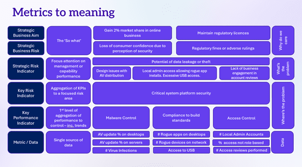
The Top-Down Method in Four Questions
- What are the business objectives? What must be true for an organization to grow, serve customers, and stay compliant?
- What security issues could compromise these objectives? Name the threats to the business – not to the technology stack, i.e., data theft impacts reputation, trust, and compliance.
- How do these issues occur? Identify the attack vectors, failure modes, and gaps that enable each issue.
- What controls exist, and what evidence proves they work? Only at this point, present the most poignant data points to surface.
This structure creates an explicit chain of reasoning: business objective to risk to control to evidence. When board members ask, “Why does this matter?” CISOs should be able trace every metric back to the first question. If they can’t, the metric probably shouldn’t be there.
Confidence: The Test Every Metric Must Pass
Once CISOs have the proper metrics, they need a way to evaluate them – honestly. The concept of controlled confidence provides a practical lens: confidence in a control is only valid if it’s been earned through evidence, not assumed because a dashboard is green.
Two tests determine whether confidence in any control is justified:
- Coverage: Is this control deployed everywhere it should be? Partial deployment is not deployment. A control that covers 80% of systems leaves 20% exposed. And, that 20% may be exactly where an organization’s most critical assets live.
- Effectiveness: Are there still issues this control should have prevented? If the answer is yes, lower the confidence score – regardless of what the coverage number says.
If either test returns an unfavorable result, the dashboard should reflect this. Do not paper over it with an arbitrary green threshold. The board shouldn’t need to read between the lines to find the exposure. It should be explicit.
Below is a summary CISOs can use as a guide to build a quadrant of confidence levels for the board:
Confidence Level Quadrant = Coverage × Effectiveness
- High coverage + High effectiveness = Controlled confidence. Earned trust. Evidence supports the green. This is the only case where confidence is fully justified.
- High coverage + Low effectiveness = Misleading comfort. Deployed widely but not working. The board sees coverage; attackers see opportunity.
- Low coverage + High effectiveness = Partial assurance. Works where deployed, but where isn’t it deployed? That gap defines the residual risk.
- Low coverage + Low effectiveness = Report it red. Both tests fail. This is not a nuance to bury in footnotes. Lead with it.
Is This an Articulation of Risk?
CISOs also need to run every metric in their board pack to determine, “Is this actually an articulation of risk or is it just an activity count with a threshold attached?”
Take this common example: “Patch compliance: 80%. Status: Green.” This reads as reassurance, but unpack it. The threshold is arbitrary since someone decided 80% deserves a green light and the number implies that 20% of systems are unpatched. Whether that 20% represents minimal exposure or existential risk depends entirely on which systems are exposed. This is information the metric inherently omits.
The 1% Problem: Consider a metric showing 99% patch compliance. Impressive at a glance, but what if the remaining 1% is a ghost server that’s been untouched for four years and runs a main line of an organization. This “green” indicator is actually red and a yellow canary that trouble is inevitable. Percentage numbers and colors are numbers and colors without the business context are not risk communication. Worse, an “all-green” dashboard conveys a false sense of security. When something breaks, leadership will remember the green. “Your reporting never suggested this was a problem” is not a line CISOs want to hear from a board chair in a post-incident review.
Use Pairs to Explain Reality
Individual metrics are almost always too weak to carry meaning on their own. The real insight lives in the relationships between metrics, and most board decks systematically destroy these relationships by presenting each number in isolation.
Consider this detection capability metric: “True positives this quarter: 47.” What does this tell the board? Almost nothing. Now pair it with Mean-Time-to-Detect (MTTD) and a trend line across six periods. Now CISOs have a story. The internal and external teams are finding more threats, faster, and improving consistently – or the inverse, which is more important to surface.
The pairing principle applies broadly. Weighted scores deserve special scrutiny. A small deterioration in a high-weighted domain (say, platform security) can be materially more dangerous than a large change in a low-weighted one. If the weighting isn’t visible, the story gets lost inside the aggregate.
Metric Pairings That Work
Below are examples of pairing that CISOs can use to report true business risk to the board:
- True positives + time to detect + trend = Detection capability signal
- Coverage % + asset criticality = Real business exposure
- Control score + domain weighting = Proportional risk signal
Don’t Fix Bad Reporting with More Reporting
When CISOs recognized their current board pack is underperforming, the instinct is often to rebuild it with more metrics, better graphics, a new framework. Resist this instinct. Replacing a bad metric pack with a slightly different metric pack solves nothing. CISOs will spend the next three board sessions explaining what changed and why, rather than discussing what actually matters, as per explained throughout this article. Let the board pull the detail through questions rather than pushing it through slides. Design board sessions for decision-making, not data consumption, by implementing these three structural standards:
- Lead with consequences, not controls. Open with business outcomes at risk. This includes customer loss, regulatory exposure, and growth impediment. Context first, then evidence.
- Use the dashboard as a delivery tool, not a pre-read. If you send the dashboard without you, the board will draw their own conclusions. Present it; don’t distribute it.
- Make the next session different, not the next version of the same thing. Snap out of the current cadence. Even a single session with a different format, a risk narrative instead of a metric pack, can reset how the board thinks about the function.
Below is a template CISOs can adopt for their board decks encapsulating the guidance in this article.
CISOs need to ensure their board has the information they need, in a form that impactfully supports the business decisions they need to make. The most dangerous security communication in the boardroom isn’t a red metric. It’s a green one that no one questions.
The “Is This Risk?” Checklist — Run this Against Every Metric Before it Reaches the Board:
- Does this number show business exposure—or just activity?
- Would a reasonable person read it as “green = safe to move on”?
- Does it need a pairing to become meaningful—and what story does the pair tell?
- If this metric is green, have you still communicated residual exposure?
- Can you trace this metric back to a specific business objective?
This is the third in a series of security risk articles by Ontinue’s security experts. You can find the full series below:

Gareth is Chief Security Advisor and CISO for Ontinue. As CISO, Gareth makes sure that Ontinue’s own internal information security – as well as security for the Ontinue ION managed extended detection and response service platform – is appropriate to the threats we face and the trust our customers put in us. As Chief Security Advisor, Gareth also has an outward-facing role to help raise awareness of new threats and novel ways of dealing with them. With Ontinue’s focus on Microsoft technologies, and the importance of people and processes, he helps potential customers understand where our services might fit.